Chapter 7 of 10: Written by Christian Harpelund
The onboarding curve: The experience doesn’t just improve over time
This is the seventh article in a series about understanding and improving organizations’ ability to onboard new employees.
Short summary (TL;DR)
Onboarding follows a curve, not a straight line. A temporary dip in the employee experience does not necessarily mean something is wrong. It can be a natural part of settling into the role and organization.
In this blog post, you’ll learn:
- why the onboarding experience often rises and falls during the first year
- what may cause the dips in the curve
- how onboarding patterns can differ between public and private organizations
- why different roles and professional fields can have very different onboarding journeys
- how knowing your own onboarding curve can help you provide support at the right time
In short: Don’t treat a dip as proof that onboarding has failed. Use it as a signal to understand what the employee needs at that stage of the journey.
From the straight line to the real journey
Most people picture onboarding as a straight line: you start somewhere, and the experience gradually improves until, one day, you’ve ‘landed.’ The data shows something different. The onboarding experience rises, falls, rises again — and sometimes falls again — before it finally stabilizes.
That’s not noise in the data. It’s a pattern that repeats itself.
It deserves its own explanation — and its own place in how you design onboarding.
If you’ve ever looked at a satisfaction dip a few months into someone’s onboarding and wondered whether something had gone wrong, this article is for you. In most cases, nothing has. The dip is the pattern working as expected — not a sign that it’s broken.
You’re reading a chapter in our new blog series on understanding and improving organizations’ ability to onboard new employees.
You are currently reading: Chapter 7: The onboarding curve: The experience doesn’t just improve over time
Read also:
Chapter 1: Most organizations ask about satisfaction. That’s the wrong question
Chapter 2: Six dimensions, one model: What good onboarding actually looks like
Chapter 3: From data to dialogue: What a dialogue report can do for your onboarding
Chapter 4: The index: How we track progress – and benchmark against others
Chapter 5: What benchmarks tell us about onboarding across age groups
Chapter 6: Six dimensions, six signals: What does a high or low score actually mean?
Chapter 8: The onboarding calendar: Does it matter what time of year you hire? – Coming soon
Chapter 9: From diagnosis to action: How to build a catalog that matches the data – Coming soon
Chapter 10: From data to prediction: What AI can do for onboarding – Coming soon
How to read the curve
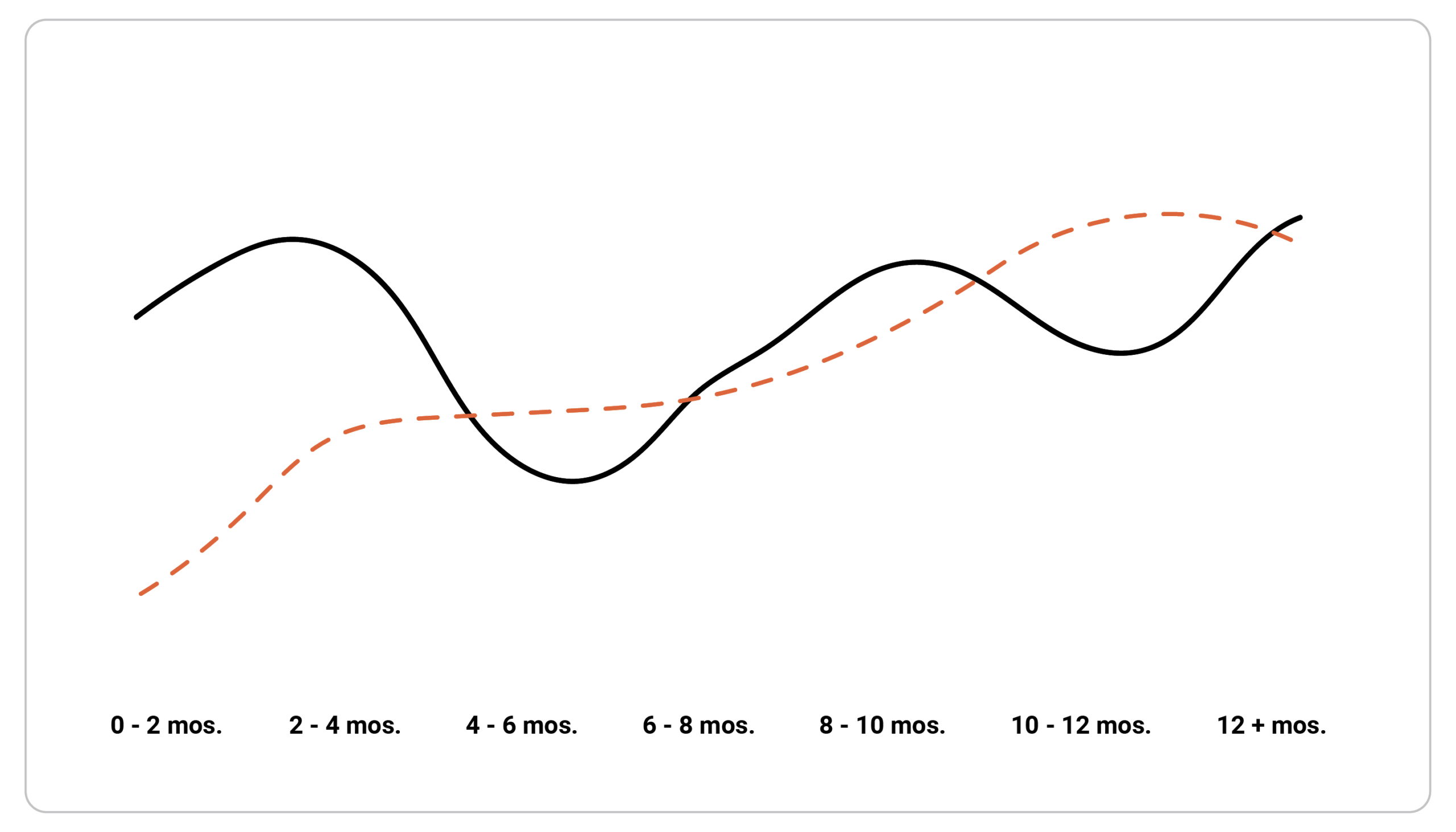
The curve is built from the same survey questions, asked at different points during the employment journey — from 0–2 months out to 12 months and beyond. That gives a picture of how the experience typically develops over the first year, not just a single snapshot.
The first thing you notice is that the curve isn’t straight. It typically starts relatively high — the first weeks are often marked by optimism and attention from the organization. Then comes a dip. Then a rise again. And in some cases, another dip, before the curve finally settles at a stable, higher level around the one-year mark.
Why does the experience dip?
It’s tempting to think the onboarding experience should just keep improving the longer someone is in the organization. But that’s not what the pattern shows. Here are a few hypotheses for why:
01 HONEYMOON
The initial rise is often driven by a ‘honeymoon effect’ — attention, a welcome plan, and the sense that everything is new and exciting. It isn’t necessarily a sign that the employee has genuinely landed — it’s a sign that the initial attention is working.
02 REALITY
The dip typically comes as attention fades: tasks become more complex, the unwritten rules start to show themselves, and the intensive introduction period ends, yet the employee still isn’t fully self-sufficient. It’s often the shift from surface to substance.
03 NEW FOOTING
The rise comes as the employee finds their footing again — competencies mature, the network grows, and the initial obstacles become things they’ve learned to navigate.
READ THE DIP CORRECTLY
A temporary drop is often a developmental stage — not proof that the onboarding has failed.
A temporary drop is often a developmental stage — not proof that the onboarding has failed.
Two dips in the public sector, one in the private sector
One interesting pattern in the data is the difference between public and private organizations. In private organizations, we typically see one dip in the curve. In public organizations, we typically see two.
When we dig into what’s driving that second dip, the data points to complexity and bureaucracy. There appear to be two distinct layers of complexity to learn to navigate — not just one. Public organizations often have more rule sets, approval levels, and formal procedures, and these layers aren’t necessarily learned at the same time, but in two separate waves.
That’s a hypothesis, not a definitive explanation — but the pattern is clear enough to be worth keeping in mind if you work with onboarding in a public organization. If you work in the private sector but recognize a similarly layered bureaucracy — a heavily regulated industry, a large matrixed corporation — this pattern may be worth checking for in your own data too.
What you can do with this
The most practical thing about knowing your own curve is that you can design onboarding to match what’s actually happening — instead of designing around an assumption of a steadily rising experience that reality rarely follows.
If you know roughly when the dip typically occurs, you can act just before it happens — with renewed structure, an extra check-in, new onboarding activities, or simply a reminder that it’s normal to experience a dip at this point. That’s significantly more effective than reacting after the dip has already happened, or missing it entirely because you only measure at the end of the process.
BEFORE THE DIP
Plan extra structure and attention.
DURING THE DIP
Normalize the experience and investigate the signal.
AFTER THE DIP
Follow up: has the employee moved forward?
It takes a year — that’s worth knowing
Another central finding is duration. In the dataset behind this curve, the experience doesn’t stabilize until around the one-year mark. That’s longer than many organizations account for when designing their onboarding programs — which often stop after three months, sometimes even sooner.
That doesn’t necessarily mean every organization needs a full year of formal onboarding programming. But it’s an important data point for your own organization: if you assume onboarding is ‘done’ after three months, while the data show the experience is still fluctuating after eight, there’s a real risk you’re withdrawing attention exactly where it still matters.
DURATION
The onboarding program doesn’t have to last a year. The attention probably should.
The onboarding program doesn’t have to last a year. The attention probably should.
The curve looks different depending on where you look
The last — and perhaps most important — point is that there’s no single, universal onboarding curve. Across different professional fields and organizational types, both the shape and the level of the curve vary significantly.
In some fields, we see large and frequent swings — several sharp dips and rises within the same year. In others, the curve is smoother but settles at a notably lower level, which is interesting in itself: a stable experience isn’t automatically a good one. And between fields, starting and ending levels can be far apart — some start high and stay there, others start low and need most of the year to catch up.
- People-facing frontline roles — the unpredictable, direct, day-to-day contact with people (whether that’s teaching, retail, hospitality, or emergency care) tends to produce the sharpest and most frequent swings.
- Complex case and relationship work — roles where each ‘case’ (a client, customer, or citizen) is unique and requires navigating rules that shift from case to case, such as casework, legal, insurance, or account management roles, often show the widest range between high and low points.
- Fields with a strong sense of vocation — roles people enter with a strong personal calling, common in healthcare and care work, but also veterinary medicine, ministry, or NGO work, often start very high and then drop sharply as the practical reality sets in.
- Staff and administrative functions — more process-oriented, less directly people-facing roles like finance, HR, or IT tend to show a smoother, more moderate pattern.
Looking at four broad types of roles helps illustrate just how different these patterns can be:
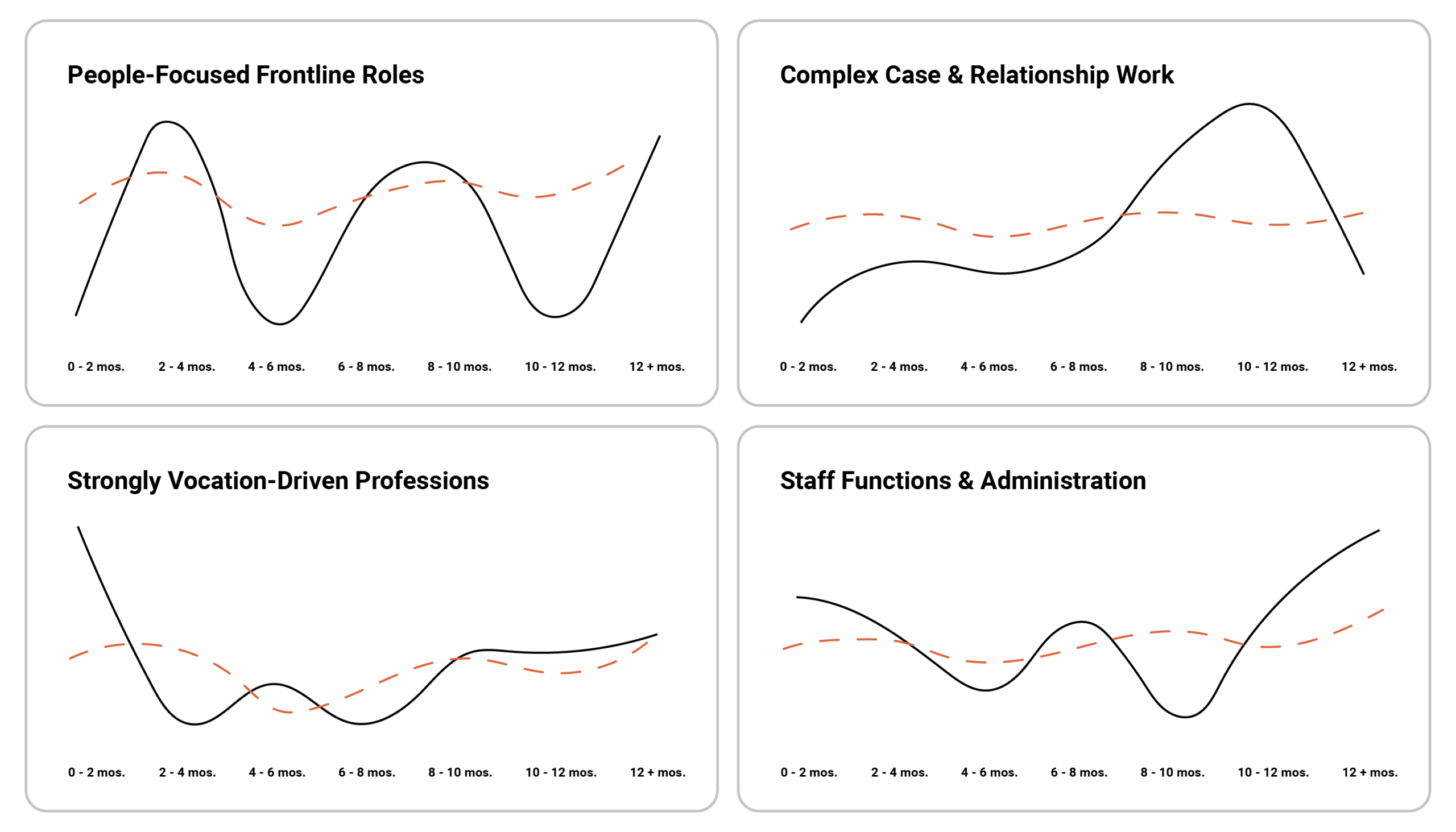
Four types of roles, four different journeys. The curve’s shape and level vary significantly depending on what kind of work you’re looking at.
Your own curve is far more useful than a generic industry curve.
If you genuinely want to design onboarding to match reality, you need to know your own pattern — not just the pattern for ‘onboarding in general.’
One curve is rarely the whole story
Knowing your own curve — where the dips typically occur, how long stabilization takes, and how the pattern varies across roles and departments — already puts you on a much stronger footing than most organizations.
But there’s another layer most people overlook: when someone is onboarded during the year may play a role that the curve alone doesn’t capture. An employee who starts right before summer holidays, or in the middle of the year’s busiest period, may have a very different journey than one who starts in a quieter quarter — even in the exact same role. That’s the subject of the next article in the series.
Before you read on, take a look at what FastTrack can do for your onboarding process. FastTrack is part of HR-ON Onbarding.
WHEN DO WE ONBOARD?
An employee who starts right before summer holidays, or in the middle of the year’s busiest period, may have a very different journey than one who starts in a quieter quarter.
An employee who starts right before summer holidays, or in the middle of the year’s busiest period, may have a very different journey than one who starts in a quieter quarter.
This is the seventh article in a series about measuring and improving onboarding.
About the author
- Christian Harpelund is a qualified organizational psychologist and works with HR-ON as an onboarding expert
- He is the author of “Onboarding: Getting New Hires off to a Flying Start” and has a new book coming soon, “Kunsten at onboarde en leder” (in Danish)
- He delivers courses and gives talks on onboarding and the organizational frameworks that support effective leadership
You might also like: Onboarding New Employees: 10 Strategies for Knowledge Development
What should you know about the onboarding experience?
What is the onboarding experience?
The onboarding experience describes how a new employee joins an organization, learns their role, builds relationships, and becomes confident in their day-to-day work.
Why does the onboarding experience change over time?
The onboarding experience rarely improves in a straight line. Employees may experience temporary dips as tasks become more complex, initial support decreases, and they begin navigating the organization more independently.
How long does the onboarding experience take to stabilize?
The data in this article suggests that the onboarding experience may not stabilize until around the one-year mark. This does not mean formal onboarding needs to last a full year, but continued attention and support can still be important.
How can organizations improve the onboarding experience?
Organizations can improve the onboarding experience by identifying when dips typically occur and providing additional structure, check-ins, or onboarding activities at those times. Looking at your own onboarding data can help you tailor support to different roles and departments.